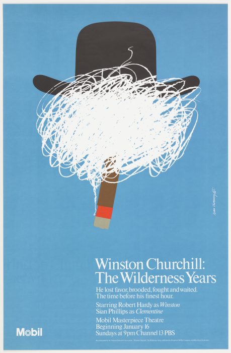
In 1957—a few years after graduation—he founded a firm in New York City with his friend and schoolmate Thomas Geismar. Chermayeff & Geismar quickly became one of the nation’s leading design consultancies. The team created visual identities for Mobil, Xerox, Pan Am, The Chase Manhattan Bank, and other rising giants of corporate America. Chermayeff & Geismar helped forge a sophisticated new approach to business communications within the rising economy of data and services. Chermayeff & Geismar’s clients also included leading cultural institutions, from MoMA to Masterpiece Theater. Business and culture were closely linked—many of Ivan Chermayeff’s most influential posters serviced Mobil’s avid sponsorship of the arts. In a 1978 opera poster, a jagged piece of cut red paper depicts an explosive burst of baritone. For Winston Churchill: The Wilderness Years, a production of Mobil Masterpiece Theater on PBS, Chermayeff portrayed the oft-depicted statesman in a new way by sandwiching a scribble of white lines between a bowler hat and a lit cigar. Ivan’s crisp, cut-paper style yielded some of the era’s most memorable cultural posters.

Poster, Mobil, Winston Churchill: The Wilderness Years; Designed by Ivan Chermayeff and Chermayeff & Geismar Associates; USA; lithograph on paper; 117.3 × 76.4 cm (46 3/16 × 30 1/16 in.); 1987-23-4
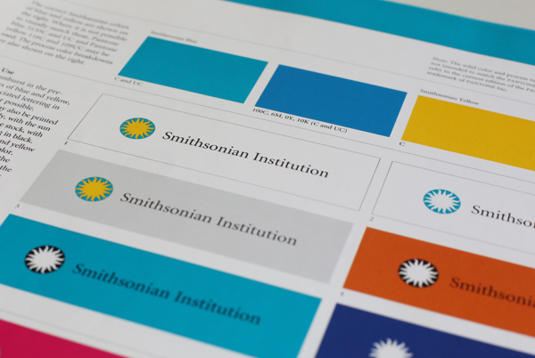
The Smithsonian Institution has been a frequent beneficiary of Ivan Chermayeff’s talent and insight. In 1998, he and his colleagues created a comprehensive visual identity system for the Smithsonian. Here, a simple sunburst symbol and understated typography aim to unify the Institution’s diverse collection of museums and research centers. For the Smithsonian’s Hirshhorn Museum and Sculpture Garden in 2010, Chermayeff & Geismar created a strong typographic mark that emphasizes the double HH’s in the middle of the museum’s name—creating a bold counterpoint to the Institutional sun. (The Hirshhorn logo functions similarly to Cooper Hewitt’s own proprietary logotype, designed by Pentagram’s Eddie Opara in 2014).
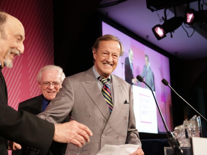
Ivan Chermayeff was at ease with any graphic design problem, from creating a cool, rational solution for a sprawling organization to assembling a playful narrative collage. When Chermayeff was inducted into the Art Directors Club Hall of Fame in 1981, he was quoted as saying, “Design is not art. Design is not terribly significant. Design is not always better than nothing. Design is the solution to problems—real, important or unimportant problems. The problems of design are not designer problems; they are client problems. Design must therefore grow out of a reasonable understanding of those problems, and their goals and aspirations.” Chermayeff earned all the highest honors of his field, including the AIGA Gold Medal and Cooper Hewitt’s 2014 National Design Award for Lifetime Achievement.
Cooper Hewitt was a beneficiary of Chermayeff’s talent for decades. In 1970, he created a letterhead and graphic identity for “Cooper-Hewitt Museum of Design” to mark the museum’s move from its downtown quarters at The Cooper Union to its uptown location in the Andrew Carnegie Mansion, Chermayeff placed an architectural blueprint of the Mansion facade on the letterhead, alongside sans-serif type in an asymmetrical arrangement. Printed in a single shade of blue, the letterhead helped give Cooper Hewitt its warm, matter-of-fact voice. While Cooper Hewitt’s graphic identity has changed over the years, its voice has stayed warm.
Ellen Lupton is Curator of Contemporary Design at Cooper Hewitt, Smithsonian Design Museum and director of the graphic design MFA program at Maryland Institute College of Art. This is an edited version of a post originally published by Cooper Hewitt on its website.
Learn more about the history of the Smithsonian Sunburst from Smithsonian Institution Archives.


